
In this post I want to talk about something that many of us already know but others really miss.
There are three different sizes and layouts for the HeroQuest cards (but we could say five or even six exist).
I am comfortable to refer to them as UK 1989, US 1989 and AH 2021 (or simply the NEW version or 2021 version).
Let's see them all in detail...
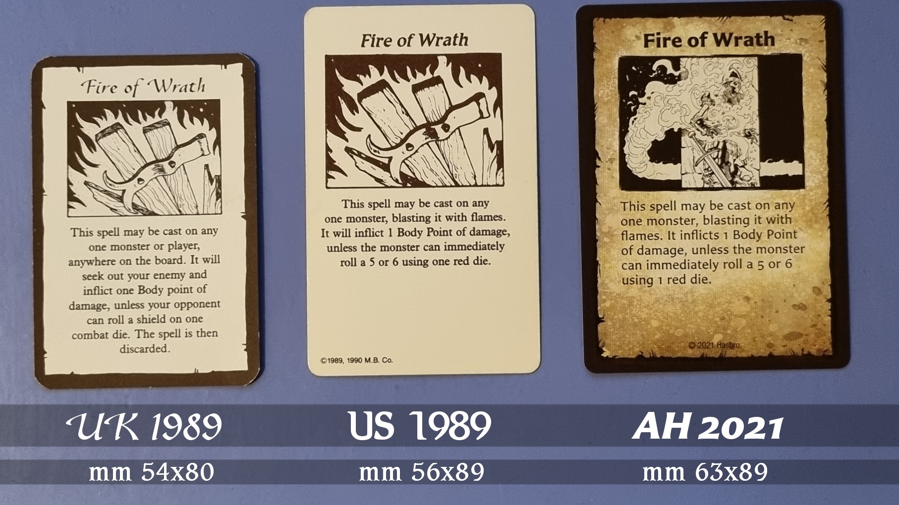
The first version is the 1989 European edition and is also the smallest one, first released in UK and later in the rest of Europe. Australian and Japanese editions of the game also features this layout. It's the smallest version of the three and measures mm 54x80 approssimatively. This version features a frame on both sides: a white grame on the cardback artwork and a brown (but sometimes almost black) around the text description on the front side, shaped as a parchment (all cards feature a different parchment frame). Card artworks were made by the great Gary Chalk (Lone Wolf).
NOTE: 1991 quest pack Against the Ogre Horde was featuring 4 new monster cards printed on the rear of the questbook. I am not sure they were intended to be cut as the size used was slightly smaller than the standard cards so they were probably intended only as a reference. We can count hem as a variant of the European layout, different in size and for the monster icons (with white circles instead of black) and the monster pictures were squared instead of being rectangular as in the main game monster cards.
The second version, US 1989, was used when the game was released in North America and Canada (1989-1992). The same layout was used for the Brazilian release. For some reason the size was increased to mm 56x89 approssimatively. Almost the same in width but way taller. It is possible they needed more space for the text as the US cards are sometimes featuring extra description.
They figured the same artworks of the UK version but they were redrawn, with slightly changes to colors and details. I don't know who did the new artworks for the US cards. The feeling is like they painted the new images over the original ones or did some really good reproductions. The slightly curved titled banner from the UK edition was replaced with a straight one and a different font was also used.
NOTE: US version of Kellar's Keep and
Return of the Witch Lord were each featuring ten mini artifact cards printed on the rear of the questbook. These cards were intended to be cut and added to the game. Althought the style was the same used in the Game System, they were drastically resized to fit into the page and their size is mm 43x65 approssimatively (yes, that's a another US layout of the cards!).
Fun fact, the fonts were changed again in 1992 with the release of Barbarian and Elf Quest Packs (The Frozen Horror and Mage of the Mirror) although they are looking very similar to the fonts used for Game-System cards (yes, that's even another layout!!).
The third layout (the new one), is used for the release of the Hasbro/Avalon Hill remake of HeroQuest in 2021.
It is not related to any country in particular as it is currently used by worldwide releases.
They changed all the graphics, fonts, artworks and even some of the titles although they recovered the text from the US 1989 version. This layout is using an even bigger card size, measuring mm 63x89 approssimatively. So, same lenght of the US cards but wider.
The artworks are digitally made and they stepped back using frames again on both sides of the cards as it was in the old UK edition.
Different artists have been hired to draw the new cards, causing a bit of inhomogeneity in the style of the artworks (some of them look cartoon while others look way more realistic).
Let's see below a comparison of the front side of the three layouts.
Curious: Fire of Frath in the original UK edition had a very cool feature: it could seek and strike an enemy anywhere on the board. This special characteristic is missing in its later releases but if you look at the new version of this card, you may notice the image is representing a fireball turning around a column to strike a skeleton that was hidden behind it. Is this a coincidence? I guess no. My guessing is since they reimplemented many cards from the UK edition that were missing in the US edition, (Holy Water and Bracers, for example) they draw the artworks by taking inspiration from a deck of UK cards but later they just copied the text from the US version as it was.


Great comparison! I had never realized how many different HeroQuest card formats existed across the various releases. The side-by-side size analysis and historical background made it much easier to understand why collectors, custom card creators, and players often run into compatibility issues when mixing content from different editions.
ReplyDeleteWhat I found most interesting was how the card dimensions evolved from the UK 1989 version to the US release and then again with the 2021 remake. Small design changes like card size, typography, artwork layout, and text spacing can have a surprisingly large impact on usability and the overall gaming experience. Your visual comparisons really highlight those differences well. :contentReference[oaicite:0]{index=0}
As someone interested in typography and design preservation, I also enjoy exploring resources related to digital fonts and script design. Readers interested in Urdu typography may find Jameel Noori and Urdu Fonts useful for discovering traditional and modern Urdu font collections.
Thanks for putting together such a detailed reference. Which card format do you personally prefer for custom content: the classic UK layout, the larger US version, or the modern 2021 design?